Skelbimas

Collapse
No announcement yet.

We're just two lost souls swimming in a fish bowl year after year

Collapse
X
 
  • Filtrai
  • Laikas
  • Show
Clear All
new posts

    We're just two lost souls swimming in a fish bowl year after year

    22
    10
    27,27%
    6
    9
    40,91%
    9
    8
    22,73%
    5
    7
    4,55%
    1
    6
    0,00%
    0
    5
    0,00%
    0
    4
    0,00%
    0
    3
    0,00%
    0
    2
    0,00%
    0
    1
    4,55%
    1

    #2
    Ech, vėl apklausa neprilipo. Bet kokiu atveju.

    Comment


      #3
      Parašė jungengg Rodyti pranešimą
      Ech, vėl apklausa neprilipo. Bet kokiu atveju.
      pataisiau

      Comment


        #4
        o aš nuotraukos nematau...

        Comment


          #5
          Running over the same old ground.
          What have you found? The same old fears.
          Wish you were here....


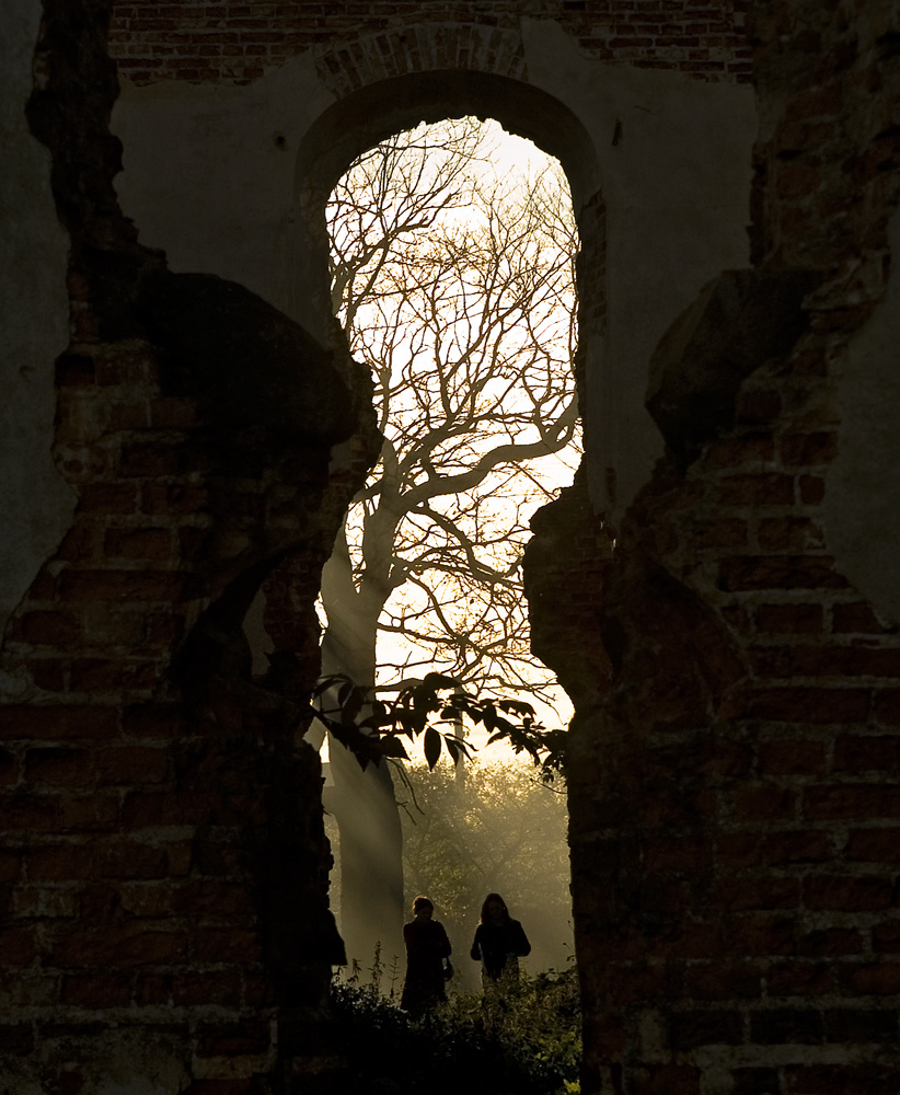
          Apacios siektiek truksta ir perdaug tos sienos. Bet sviesa fone tiesiog fantastiska.

          Comment


            #6
            Parašė liutass Rodyti pranešimą
            pataisiau
            ačū

            Comment


              #7
              Noretusi daugiau apacios ir maziau virsaus.
              Jedi power!

              Comment


                #8
                Parašė Ramunas Rodyti pranešimą
                Noretusi daugiau apacios ir maziau virsaus.
                Aišku įvairūs variantai galimi.
                Bet to medžio šakos aukštai, o arkos (lango) viršų norėjos palikti įrėminimui.

                Comment


                  #9
                  Galima būtų biški paeksperimentuot su netradiciniu formatu ir apkarpius tas sienas iš šonų padaryt tokią pailgą.

                  Comment


                    #10
                    grazu... 9

                    Comment


                      #11
                      Šiap sau. Šiek tiek tarptautinės kritikos sau:

                      I love this photo, it is an excellent idea, it is like a keyhole made by nature. The sunrays are very nice and add to the atmosphere of the pic. I just would like to see a bit more contrast and the top of the tree could also be a bit sharper. Thank you for sharing

                      ir būkim biedni bei teisingi


                      it has potential, but it doesn't thumbnail well. it would be better as a black and white, keeping the brick bright to center the attention to the darker people. the sun rays are nice, the brick could be sharper. the people add much to this.

                      (šypsenėlė)

                      Comment


                        #12
                        sviesa fantastiska. ir ideja man patinka
                        www.tomflagman.com

                        Comment

                        Working...
                        X